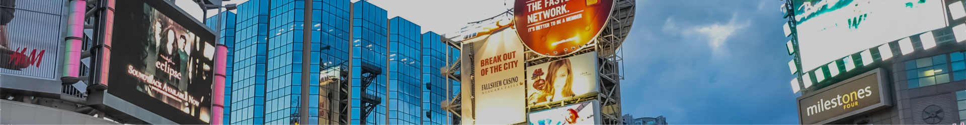
Top 10 Outdoor Signage Mistakes to Avoid

If your business had a face, it would be your outdoor signage. Customers tend to form their first impression and judge your company based on your business signs, particularly the storefront signs. They tend to reflect the level of care and effort that has gone into the business overall.
Because of this, your outdoor signage is an invaluable tool in your branding, marketing, and advertising efforts. It should communicate your brand and represent the quality of products and service customers can expect from you. When looking to design great signs, be sure to avoid these ten common mistakes.
10 Errors that You Should Avoid When Designing Outdoor Signage
Poor Colour Choice
It is very easy to get your colours wrong. For a business that already has an established colour scheme, sticking to it but not considering contrast can easily result in a pretty sign that is difficult to read from far away. Alternatively, you can choose to go with bright, high contrast colours and end up with a messy sign that is hard on the eyes.
The key here is to have enough contrast on your business signs that they can be read from a distance but do not look dull and cheap. Pairing warm and cool colours or utilizing colour blocking in your marketing materials can help you stand out and look great.
Uneven Spacing
Although this is mainly a challenge for DIY small business signs, it is still a common mistake that can make your sign hard to read. If you are designing your business signs, keep the following best practices in mind when spacing.
- Ensure the font transfers well, and you have even letter spacing throughout the text.
- Balance the spacing around your letters with the size of the text to allow enough negative space for legibility and visual appeal.
The general rule is that the total height of the negative space should be approximately half the text height, while the width of the negative space should be equal to the height of the negative space below the text.
Illegible
This is the most important aspect of outdoor signage. To ensure your signs are legible, take note of the colour, contrast and spacing, as well as the font selection. Choose a font that is visible from a distance. Avoid fancy scripts, old English, or anything too thin, bold, or messy. Most people do not wish to spend time deciphering your sign – it should be clear and obvious.
Bad Art
If you intend to have an image, logo, or any art on your outdoor signage, there are many ways it could go wrong. Therefore, make sure it is clear and is an accurate and appropriate representation of your brand. It helps to have some people unrelated to your business give you their thoughts.
The other thing you must consider, particularly with outdoor signage, is if the sign is big and simple enough to be seen and read by people across the road, parking lot, or even highway. Also, the key guiding rule here is to understand your target audience. The more feedback and perspective you can get on your art, the better it will turn out.
Transfer Issues
This is another common issue with DIY small business signs that can be avoided by working with a professional signage business. When transferring your design from the platform to the printing software, letters and images can flip and end up backwards or upside down. These errors can result in several scrapped sign projects and rack up costs.
Improper Installation
Installation is also very important for the safety of your staff and the longevity of your sign. Damage caused during installation can accelerate chipping and rust, lowering the lifespan of your business signs. You also risk property damage, accidents, and injury, which can have very negative implications. Your sign should not be a liability. Make sure it is professionally and securely installed in the right position.
Wrong Material
You do not have to spend huge sums of money to get a material and product that will perform well in your location. First, it is important to consider the weather the sign will be exposed to. For a rainy area, consider waterproof materials. If it will be in the sun most of the time, you will need fade-resistant ink. The type of material, design, and sign should also match the nature of your business and brand image. Your business signage professional can help you select the best materials for your application.
Size – Too Big or Small
The size of your sign will largely depend on where the people you are targeting will be. It is important to reach as many people as possible both in cars and on foot. The sign should be small enough for those close to it to read and large enough for those far away to see it clearly. Generally, 4-inch text can be seen for up to 100 feet, 16 inches for up to a city block, while 57 inches is readable for a quarter-mile. Remember that you want people to see your sign, read it, and understand it at a glance.
Poor Visibility
Keep in mind that you are designing your outdoor business signs for your audience. Therefore, evaluate it from their perspective, through different seasons and times of the day. Can it be seen at night or under a shadow during the afternoon? Your sign should be visible at all times to reap the maximum benefit from it.
Location
The ability of people to see your sign will also depend on where you install it. Choose a location that ensures maximum, uninterrupted visibility across seasons and time of the day. The sign should not be hidden behind landscaping and foliage during spring or behind a shadow.
Trust Us for Reliable Outdoor Business Signs in Toronto
Your business signage ties together all the effort you have put towards developing your logo, website, and business image. Having professional, easy to read, and engaging storefront signs can help you make a positive first impression on your target audience. They can be the difference between a prospective customer coming in or walking by.
At The Sign & Graphics Manufaktur, we go the extra mile to ensure that your signs not only avoid the ten mistakes listed above but that they elevate your brand, help you communicate, and draw traffic into your business. Contact us today to learn more about how we can help you achieve more with your business signs.
Also Read:
- Signage 101 – Why New Businesses Need Signs?
- What Sign Manufacturers Can Do For Your Business in The GTA
- How Signs Can Help You Grow Your Business