12 Real Estate Sign Design Ideas that Attract Attention

If you’re in the real estate industry, you know how important good signage is for promoting your business. You can use signs to advertise your services, point your audience in the direction of your newest homes for sale, or just spread the word about your company.
However, there’s more to creating an effective real estate sign than simply filling out a template and calling it a day. Real estate signs in Toronto need to stand out from all the other signs around them. Our list of 12 tips for designing real estate signs will help you craft signage that will win you plenty of new business in this highly competitive region.
Ideas for Sales Signs
Feature an Image of the House
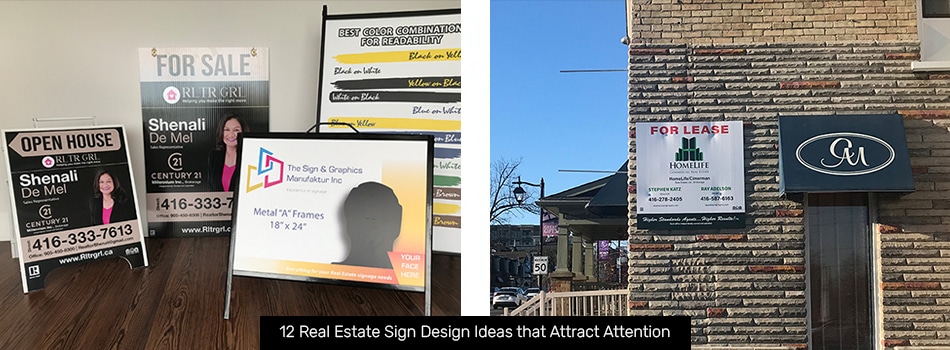
Basic real estate signs are text-only and don’t attract much attention from people who aren’t specifically out house-hunting. Including an image of the house alongside the text makes the sign much more distinctive and can spark a slew of ideas in your audience’s minds. Getting a sneak peek at the inside of a home piques people’s curiosity and makes them want to know more. With any luck, they’ll be interested enough to sign up for your next open house!
Include Your Brand
It might sound like a no-brainer, but make sure your real estate company’s name and logo are easily visible on all your real estate signs. Including these elements allows you to build brand recognition and consumer trust through excellent service.
Keep Your Text Large & Simple
Real estate signs need to be easy to read from a distance. Choose large, simple fonts without serifs or other decorative elements. Only include the information that your audience will need to find the house you’re advertising, such as its address and the name of the realtor representing it.
Unique Vanity Numbers for Each Sign
Thanks to new technologies like Google Voice, it’s easy to generate as many unique phone numbers as you want. Consider using this tech to add a unique number to each sign you put up. Tracking the number of calls you receive at each number will show you which areas are most interested in your services. You can then increase your marketing budget in these areas to improve your ROI.
Open House Signs
Choose Bold Colours
Colour contrast is an easy and effective way to get viewers’ attention. Choose bold colours that pair well together, such as blue and orange or purple and yellow. You can even add a metallic coating to some areas of your sign to make the full design stand out even more.
Use a Unique Shape
Die-cut signs are great for adding personality and appeal to your open-house signage. You can get signs shaped like an arrow, a star, or even a map marker. Your audience is sure to take notice of these novel shapes, and you might even attract attention from people who were previously loyal to your competitors.
Go with a Colour Block Design
Colour block designs are easy to read while still retaining plenty of visual interest. Separate your design into two or three distinct blocks and choose a colour for each of them. High-contrast colours work best, but you can also go for a stylish monochromatic palette if you’re going for an upscale professional vibe.
Directional Real Estate Signs
Use Attractive Colours
Colour is one of your most effective tools when designing directional signs for real estate. Bright colours like red, yellow, blue, and purple pull your audience’s eyes to your sign and ensure that they know where you want them to go. No matter what palette you choose to go with, be sure to choose your sign’s colours based on the environment where you intend to place it. You don’t want it to blend into the background!
Go Big or Go Home
Directional signs for businesses need to get noticed to be effective. One of the easiest ways to make sure everyone sees your directional real estate sign is to make it as large as possible. Consider using banners, flags sign, and other large signs to promote your clients’ properties in high-traffic areas around the neighbourhood. You’ll find that the extra visibility makes a big difference.
Don’t Forget Arrows
Arrows point viewers toward your sale property much more concretely than addresses alone. They also make viewers curious about what the arrow is pointing to – kind of like an ‘X’ on a treasure map. Add an arrow to some of your real estate for sale signs and see how much more foot traffic you’ll get as a result.
Real Estate Agent Signs
Include a Team Image
If you’re promoting your real estate team, the best thing you can do to drum up interest is to include a picture of everyone on your staff. Showing your team’s faces builds trust and creates a connection between your agents and your audience, making them more likely to call you the next time they need a real estate agent’s help.
Go Modern
Many real estate agents’ signs look incredibly similar to one another, making it tough for individual agents to stand out. You can give your team a marketing boost by opting for a modern design in your signs. By incorporating interesting graphics, colours, and shapes, you’ll create signs that will look like nothing else your audience has seen from other local agents.
Create Standout Real Estate Signs with The Sign & Graphics Manufaktur
If you’re interested in creating new real estate signage for your business, you’ve come to the right sign company in Toronto at The Sign & Graphics Manufaktur. We design and fabricate all kinds of business signage, from real estate signs and banners to office directional signs. Contact us today to discuss your signage needs, and let us help you make a well-deserved splash with your latest signs.
Also Read:
- Using Real Estate Signs as a Marketing Tool in Toronto
- How Much Does a Real Estate Sign Cost?
- Real Estate Signage Best Practices: Creating Real Estate Signs that Sell


