Your Guide to Creating a Successful Banner Design

Banners are one of the most versatile types of business signs out there. You can place them indoors or outdoors, on the floor or the ceiling, and have them printed with custom messaging to advertise anything from new products to your grand opening.
How can you design a banner that will stick with your audience? There are a few tricks to it. Follow our guide to effective banner design before you make an order for custom banner printing.
Determine the Purpose of Your Banner
Banners can be made with many different purposes in mind. Narrow yours down before you start designing to keep your project cohesive.
Branding
A banner made to spread brand awareness should prominently feature your business’ name, logo, and website. Your audience should be able to tell exactly who you are and how to reach you just by glancing at the finished product.
Informing
Banners that are meant to provide information should be as simple and clear as possible. While you’ll want to keep your business name on there, it’s best to leave any other extraneous details out of your banner design. Keep the focus on the message you’re trying to send!
Advertising and Promotion
Banners that aim to advertise or promote something can be a little more elaborate than banners that are meant to be purely informative. For example, you can add graphics or fun fonts to grab your audience’s attention. Don’t get carried away, though – stick to highlighting just one promotion at a time for the sake of clarity.
Follow These Visual Designs Basics for a Clear, Beautiful Banner
Colour
Colour is very important for grabbing people’s attention in busy environments. Choose colours that fit with your brand but also stand out from the banner’s surroundings. Keep your palette fairly limited to make sure the visuals read well from a distance.
Usually, choosing one main colour and a single accent colour works best. You can sometimes get away with adding one more accent colour for a total of three but try not to go beyond that number. Too many colours can quickly make a banner design look cluttered and unfocused.
Message
Banners are often viewed for a split second as someone walks or drives by them, so they need to be extremely easy to read. Keep your message short and sweet – just one line is best. Distill the essence of what you want to say into as few words as possible, and make those words the focus of your banner. If your overall design is strong, people will be intrigued enough to look closer and notice your business name and logo.
Imagery
Not all banners need photos or graphics, but if you’re going to include them, you need to be very purposeful about it. Use just one simple image that clearly ties into the main point of your banner. It should be easy to decipher the meaning of the graphic from a distance without giving it much thought. For example, automotive signs and banners often feature images of cars.
Images should be considered supporting elements only. Don’t rely on a photo or graphic to get your ideas across. It’s too easy for people to misinterpret them. Use clear words to convey your point and use images to reinforce what you’re saying.
Typography
When choosing your banner’s fonts, visibility should be your number-one concern. A font that looks great and complements your brand well but can’t be read easily will not be effective. Choose bold fonts that stand out from your background and don’t look like they might be mere graphics. Every word should be easy to read, even when a person is somewhat distracted. Remember, most people will not give your banner their full attention!
Make Sure Your Messaging Reaches Your Audience
Timing
Thoughtful timing is critical to effective banner design. If you’re using your banner to communicate time-sensitive information, be sure to have it printed and hung up well before the event you’re advertising. This gives people time to notice it during their daily activities and make plans to visit your location at the appropriate time.
If you’re designing a banner you intend to use on a semi-permanent basis, consider creating a few different versions of your design that incorporate seasonal colours or motifs. This makes your banner feel fresh and current, no matter what time of year it is.
Cohesive Clarity
Remember that although you might work on each aspect of your banner individually, your audience will only see the finished product. It’s important to make sure that product is cohesive. All elements of your banner should work together to get your point across. If an image, font, or phrase looks out of place, replace it before finalizing your design. The whole thing should look intentional and purposeful, clearly communicating your intent.
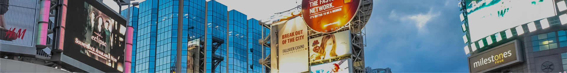
Location
Your banner’s location is arguably the most important part of its design. After all, if it doesn’t get noticed, it can’t get your message across.
You can hang banners almost anywhere by using either ropes and cords or a banner frame. Be sure to decide which method you’ll use before you finalize your design so your sign company can fabricate the banner with the necessary grommets or other fastenings. Choose a spot that gets a lot of foot traffic so as many people as possible will see it. Check your local laws before you put your banner up, though! Some cities don’t allow banners in certain places, and others require businesses to get a permit first.
Get Premium Banner and Sign Printing Services with The Sign & Graphics Manufaktur
Is banner design starting to sound like a big headache? Don’t worry. At The Sign & Graphics Manufaktur, we’re always happy to help when you need banner printing in Toronto, and we’ll even help you come up with your sign design. Contact us today to hear more about our commercial sign printing services and how they can help you reach new audiences all around town.
Back