Retail Sign Printing Tips to Increase Foot Traffic
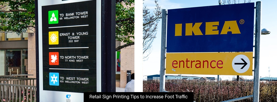
If you run a small business, you’re probably always looking for ways to increase your foot traffic. Every person who visits your store is a potential new customer to build your company’s bottom line.
Installing the right signage in and around your store is one of the best ways to draw people in and get them to explore your location. As one of the top sign makers in Toronto, we know a thing or two about what it takes to make an attention-grabbing sign. Here are our top tips for sign printing when you want to attract more customers to your store.
Set Up a Wide Variety of Signs
Knowing which signs are most useful for which audiences will help you reach more people around your store. The more signs you put up, the more likely it is that you will catch someone’s eye.
Outdoor Signage
Your outdoor signs will provide most customers with their first taste of what your business is like. Making a good impression is critical to closing a sale with them.
Not only should your business have an eye-catching storefront sign hanging over the door, but you should also mix a few different types of signs into your street displays. Banners made with fabric printing work well for seasonal events or major promotions, while sidewalk signs are perfect for your everyday sales.
Display Signage
Display signs come in many forms, including window signage, permanent indoor signage, and portable table signs or A-frame signs. These signs are usually the next thing your customers will notice. They should offer more information about the products or services you offer while still being easy to read at a glance.
Promotional Signage
Promotional signage informs your customers of any deals or new product launches you have going on in your store. You can use promotional signs inside and outside your store to draw attention to anything you want to highlight. Place these signs in easy-to-spot locations so they’re sure to catch the eyes of passers-by.
Directional Signage
Directional signage helps guide your customers around your store. You can use directional signs to point out different sections of your store or point out the locations of certain popular products. Your customers are sure to appreciate the helping hand!
Understand the Proper Placement
Placing your signs strategically is key to getting good results. Think about the audience you’re trying to attract and which sign positions are most likely to draw their eye.
For example, people passing by your storefront in cars will probably only glance at your shop, so a big storefront sign works great for them. On the other hand, people passing by your store in the street will probably pay more attention to window signs.
This strategy should carry over to your indoor signs too. Most people will notice signs placed at eye level, but it’s a good idea to include a few at lower levels to accommodate short people, wheelchair users, and children. Placing key signage like directional signs high overhead ensures that everyone in your store will always be able to see them if they look up.
Sign Printing Tips
- Use Bold Fonts. A sign that no one can read might as well not exist. Choose bold, clear fonts for your signs, especially if they will be displayed outdoors, where people will probably be reading them at a distance. The same goes for aisle signs and other key signage inside your store. Never sacrifice readability for style.
- Edit Copy for Your Signage. Choosing exactly the right words to put on a sign is a difficult process. You’ll probably go through a few different versions of your sign copy, and that’s okay! Keep refining your ideas until you’ve distilled your message into just a handful of clear, concise words.
- Incorporate Colour Theory. Your signage’s colours can be some of your most potent marketing tools. Choose colours that evoke the emotions you want to stir up in your customers. For example, you might design a yellow sign for a sunny summer sale or a cool blue sign to advertise a new tech product you just got in.
Stand Out from the Competition
Remember – your sign doesn’t exist in a vacuum. It’s constantly competing for your audience’s attention, and it will have to win out over hundreds of other signs and ads to get it.
Design your signage to stand out from the crowd. Look at the signs in the area around you and come up with a design that offers something that none of the rest have. The more out of place your sign looks in its surroundings, the more attention it will draw.
Order Standout Custom Business Signs in Toronto Today
Sign & Graphics Manufaktur is the place to go when you’re looking for a “sign shop near me.” Our vinyl sign shop designs and fabricates all kinds of signs for businesses both large and small. We’d be happy to help you create the signs you need to drum up more interest in your store. Contact us right now to discuss your signage needs and get started.
Back