The Importance of Typography in Banner Printing
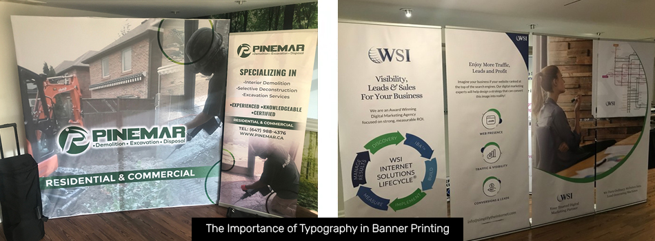
Good typography is one of the most important elements of effective banner design. Whether you want to try out some new ideas for your banner text or are just starting to learn more about banner design, here are some typographical tips to keep in mind during your next custom banner printing project.
Why You Should Choose Typography Carefully
Reduce Eye Fatigue
Reading a banner with a lot of text on it can easily cause eye strain. You don’t want your audience to associate headaches with your brand! Good typography will make your message easier to read and will help people engage fully with what you have to say.
Communicate Clear Messages
Typography is great for underlining the main points of a banner’s message. You can use it to highlight your call to action and motivate your audience to interact with your brand.
Increase Accessibility
Many people who are visually impaired, dyslexic, colour blind, or have other disabilities struggle to read large blocks of text with poor contrast. Typography can break up the words in a way that makes it easier for everyone to understand.
Establish Hierarchy
Not every part of your message is equally important. Good typography lays out your points in order of importance, making it easier to follow your train of thought. This will also make your banner easier to read at a glance.
Show Personality
Every brand has its own distinct look and feel. Choosing fonts, colours, and text placement that suit your business’s vibe will let your audience know what kind of organization you are and what they can expect from you.
Promote Brand Recognition
Consistency is key to building a solid brand. Keeping your typography similar from project to project helps you maintain a clear brand aesthetic that your audience will grow to recognize.
Main Types of Fonts for Banner Printing in Toronto
There are four main types of fonts you can use to design your banners.
- Serif. Serif fonts are fonts with thin lines at the top and bottom of each letter. Serif fonts are easy to read, making them a great choice for banners with lots of text on them. They’re best suited for brands that want to convey a sense of security and trust.
- Sans Serif. Sans serif fonts don’t include the serif line on their letters. This makes them a little harder to read than their serif counterparts. However, they tend to look more visually interesting and can be used to set your brand apart from the competition.
- Script. Script fonts use elegant, flowing letters to create an aura of professionalism and expertise. While they look beautiful, they can be difficult to read in small sizes. Use them sparingly to make sure your message doesn’t get lost.
- Hand Lettering. Hand lettering fonts replicate the look of handwritten words. There are many different styles of hand lettering font, but all of them can make your audience feel closer to your brand. Just make sure the one you choose is still easy to read!
Visit Us for Custom Banner Printing in Toronto
Do you have a banner design in mind? You can visit The Sign & Graphics Manufaktur anytime for your banner printing needs, including banner printing in Toronto. If not, our team will be happy to help you come up with a design that will wow your audience. Contact us today for more details on our sign design and printing services or to get a quote for your project.
Also Read:
Back