7 Tips to Create Attractive Storefront Signs

Storefront signs are many businesses’ primary way of capturing customers’ attention, so it’s important to make them count. Paying careful attention to marketing considerations is key to achieving a healthy ROI on your sign budget. Follow our seven guidelines to create strategically designed signs that will help you build your brand and drum up sales for your business.
7 Tips for Designing Exceptional Storefront Signs
Keep Things Brief
You probably have a lot to say about your business, but your storefront sign isn’t the place for long paragraphs of text. Keep your sign’s message focused and clear.
Most of the time, you’ll want to have your company’s name and logo so that would-be customers can connect your sign to your brand. You can also include a slogan or some other important information. For clarity, have only what you need to get your point across.
Use Easy-to-Read Fonts
People passing by your storefront won’t necessarily stop to read your signage – most of the time, they will glance at it while walking or driving toward their destination. This means that slender, curly, or elaborate fonts are not a good idea.
Instead, choose clear, bold fonts with little extra decoration to make your sign easy to read. Be sure to check whether your text has proper kerning (spacing between letters) to make it easier to distinguish one letter from another. If you have to look at your sign twice to see what it says, the font needs some tweaking.
Consult the Colour Wheel
Think about what you want your sign to say and choose colours that match your intent. Bright reds and yellows command attention and convey urgency. Purples and golds look exclusive and luxurious. Soft blues and greens calm the viewer and offer a feeling of reassurance. The colour wheel has a lot of valuable information to offer on promotional messaging.
Colour schemes are an essential part of your sign’s effectiveness, too. High-contrast colour schemes like white and black have been shown to improve customer responsiveness. Complementary colours like blue and orange make each other look brighter and more vibrant, which is perfect for energetic brands. Monochromatic colour schemes either use just one colour or many shades of the same colour to create a soothing, professional-looking aura.
Think About Size
Now that sign design is mainly done using software, it’s easy to scale any sign to any size. However, you should still think carefully about what size you want your printed sign to be – bigger isn’t always better.
If your sign is meant to be viewed from far away, make sure it’s big enough to stay legible. If it’s meant to be displayed in your store window for people passing by, make it smaller to avoid overwhelming the viewer.
Focus on Branding
Building a brand requires consistency, and this includes the look and feel of your store signs. The colours, fonts, and general look of your signs should all align with your overall branding strategy.
For instance, you shouldn’t use a bold, in-your-face sign design if you’re running a small, elegant flower shop. However, that design might work perfectly for a gym that appeals to active, high-energy customers. Match your design to your branding goals and keep your signage cohesive to cultivate that all-important brand image that companies rely on.
Consider Location
Have you thought about where you’ll place your sign when it’s done? Location is an important factor in sign success. Directional signage should be placed a bit higher than eye level so customers can see it when scanning the area from a distance. Promotional signage, on the other hand, should be placed a bit lower so customers can’t miss it as they walk by.
Remember that “eye-level” doesn’t mean the same thing for all potential viewers. Think about who you’re trying to reach with your message and place your sign appropriately to make it more effective. For instance, toy store signs targeted at children, should probably be placed much lower to the ground than signs in a women’s clothing shop.
Match Form and Function
Storefront signs can serve different purposes depending on your needs, and it’s important to reflect your intentions in your sign design.
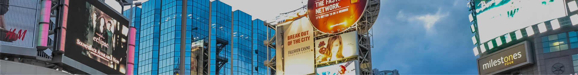
Outdoor
Outdoor signs need to draw attention, so they should be showy and eye-catching. Many businesses accomplish this using humour, which is an easy way to get the job done without requiring too much intensive graphic design. Your outdoor signs will need to be changed frequently to keep people who pass by every day from tuning them out.
Don’t get carried away, though – your sign should still clearly convey what your business does and why your customers should care. Don’t let jokes get in the way of clarity!
Directional
Directional signs serve a specific purpose, so they should be kept as simple and direct as possible. You can add a little flourish to your directional sign design, but keep the message clear.
Remember that directional signs should also be designed to help customers with disabilities navigate your store. Be sure to create yours with local accessibility laws in mind. A professional sign company that works with businesses in your area will know how to do this.
Promotional
Promotional signs are used to highlight sales, new products, in-store events, and more. These signs should appeal to your key demographics and make a clear value proposition to give those people a reason to head into your store.
You can get pretty flashy with promotional signage but remember that you are still representing your company as a whole. Your signs should fit the tone of your brand while still making a significant impact on the viewer.
Digital
Digital signs are designed for display on TVs, digital billboards, and other devices.
One of the biggest strengths of digital signs is that they can be used to display customized messages to specific customers. This can be based on factors like the weather and the time of day. For example, a corner store might use a digital sign to promote ice cream around noon on a hot day. You can also target certain customers with messaging that speaks to their needs. Think about how best to use this unique ability when designing your digital signs.
Get Custom Business Signs from a Leading Sign Design Company
Make your next storefront sign a success with help from the best sign company in Toronto: The Sign & Graphics Manufaktur. We’ll help you through every stage of the process, from design to manufacturing, to ensure the final product is the perfect fit for your business’s needs. Contact us today at 905-670-0797 or get a free online quote for your upcoming sign project.
Also Read:
Back