10 Mistakes to Avoid When Designing Vehicle Wraps
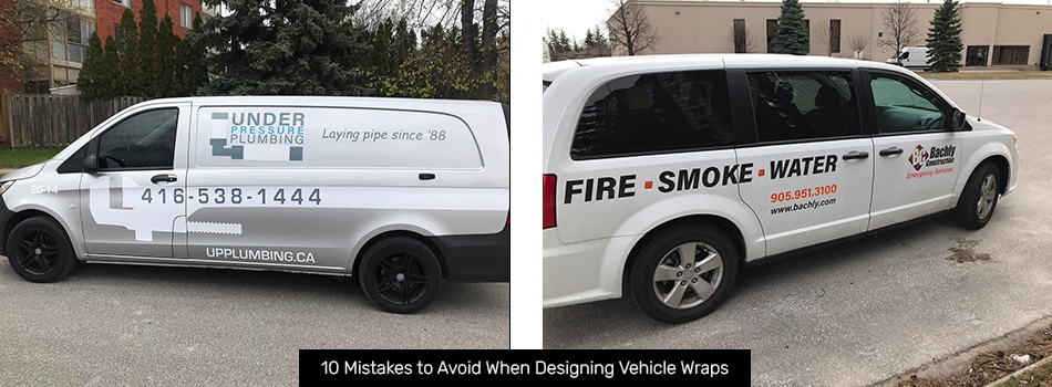
Vehicle wraps are one of the most highly visible forms of advertising available. A wrapped vehicle driven around downtown Toronto could be seen by thousands of people each day, generating plenty of buzz for your business.
Unfortunately, this incredible exposure can be a double-edged sword. Many things can go wrong during the vehicle wrap design and installation process. What happens if your vehicle wrap makes the wrong impression? The ten problems listed below are just some of the many mistakes some businesses make when designing and applying vehicle wraps for their fleet.
10 Common Vehicle Graphics Mistakes to Avoid
1. Using Poor Quality Materials
Like any sign, a vehicle wrap must be made from high-quality materials if you want it to last. Wraps made from sub-standard vinyl will peel and discolour much sooner than their higher-grade counterparts. On the other hand, a high-quality wrap can protect your car from scratches, rust, and other minor damage, making it an even better investment.
2. Making the Graphic the Wrong Size
Vehicles come in different sizes, and so do vehicle wraps. Truck wraps need to be made larger than car wraps, and trailer wraps may need to be even bigger depending on their size. If your wrap is too big or too small for the surface you want to apply it to, the graphic won’t cover the area the way you intended. For the best results, measure your surface area first and design your vehicle graphics based on those dimensions.
3. Ignoring the Shape of the Vehicle
A vehicle is a 3D object with many sharp angles, rounded areas, and clear seams where different parts meet. If your vehicle wrap doesn’t take these features into account, the design will not display properly when the wrap is applied. You might notice lettering getting cut off by a door seam or a logo that gets stretched so tightly over a protrusion that it becomes unrecognizable.
To avoid this, picture how your design will be overlaid on your vehicle. Then, avoid placing key elements in areas that will be distorted by the shape of the car.
4. Overlooking Misspellings and Typos
Typos happen to the best of us, but failing to catch them on a vehicle wrap leaves your business looking unprofessional and inattentive.
Before you send your vehicle wrap design off to be printed, ask yourself a few questions. Is everything spelled correctly? Is all your contact information correct? Have you missed a word somewhere by accident? Sometimes it’s difficult to notice these things yourself, so if possible, have an outsider look your design over and confirm that you haven’t missed anything.
5. Choosing an Illegible Font
Vehicle wraps will often be viewed in motion, so it’s best to avoid spindly or script-like fonts that can blur easily and are hard to make out from a distance.
Simple sans serif fonts like Arial or Helvetica will be the easiest for passers-by to read quickly before your vehicle drives away. If you have a special font you want to use to better represent your brand, consider using additional elements like borders or backgrounds to make it easier to read at a glance.
6. Including Too Many Elements in the Design
While vehicle graphics can be very high-impact, they shouldn’t be over-designed. If there is too much visual noise going on, anyone who sees your vehicle wrap will be too overwhelmed to register the name of your company or any other key information. Keep your design simple yet bold to capture people’s attention without undermining its purpose as an advertising channel.
7. Forgetting Critical Information
If your vehicle wrap doesn’t include important information like your business name, logo, address, phone number, and other key details, people who see it won’t be able to find your business afterwards. Make sure this information is included and is visible from as many angles as possible. Ideally, it should be printed on both sides of the vehicle and sometimes the back or hood if the design calls for it.
8. Choosing the Wrong Colour
Colours significantly impact on how we process visual information and how easy it is to read text. For example, light grey text on a white background or midnight blue text on a black background is almost illegible.
If you choose unremarkable, low-contrast colours for your vehicle wraps, it’ll be hard for your audience to see them properly. Instead, design your sign using high-contrast colours, like black and white, or complementary colours, like blue and orange. These will attract interest and make the text pop.
9. Neglecting Vehicle Preparation
Did you know that not washing your car before applying a vehicle wrap can ruin the look of the final product? Any dirt, grease, or other contaminants that sit between your vehicle and the vinyl wrap can dislodge the glue that holds the wrap down and cause bubbling, creasing, and other problems. Be sure to clean the surface of your vehicle thoroughly before attempting to apply a wrap to it.
10. Overstretching the Wrap
Vinyl wrap is made to stretch a little to accommodate the different shapes and surfaces on a typical vehicle. However, pulling it too much will distort the graphics printed on it and may cause thinning and tearing. This also spreads out the heated glue that keeps it stuck to the vehicle, which may cause the graphic to bubble, rip, or peel off.
The best way to avoid overstretching is to have your vehicle graphics installed by professionals who know how to handle vinyl properly. This will leave you with a smooth and secure finish that looks exactly as you intended.
Choose Us for Outstanding Vehicle Wraps in Toronto
Want to make sure your vehicle graphics are done right? Choose Sign & Graphics Manufaktur for the job. We are a leading provider of fleet graphics in Toronto, including car, truck, and trailer wraps to fit vehicles of any size.
Whether you need help putting a design together or already have one in mind, we’ll produce and install crisp, vibrant vehicle graphics that are sure to catch everyone’s eye as you drive by. Contact us at 905-670-0797 or request a quote through our online form to get the process started.
Back