
Real Estate Sign Design Tips
In Toronto’s competitive real estate market, effective signage remains one of the most reliable tools for attracting attention and generating inquiries. While online listings dominate the initial search process, physical signage continues to influence walk-ins, neighbourhood buyers, and investors who are actively driving through target areas. Applying proven real estate sign design tips ensures your listings stand out in busy residential streets, suburban developments, and commercial corridors across the GTA.
Professional signage does more than advertise a property. It reflects your professionalism, brand standards, and market positioning. A clean, well-designed sign communicates trust and confidence before a prospective buyer ever makes a call. In many neighbourhoods, particularly in areas with steady foot traffic, signage can also capture local interest from residents who may know someone looking to move nearby.
High-quality, strategically fabricated real estate signage helps agents create consistent visual recognition across multiple listings. From detached homes in Etobicoke to retail units in Mississauga, strong signage increases brand familiarity and reinforces your presence within the community. For guidance tailored to property type, placement, and durability requirements, connecting through the contact page ensures your signage strategy aligns with your marketing objectives.
What to Include on Your Real Estate Signs
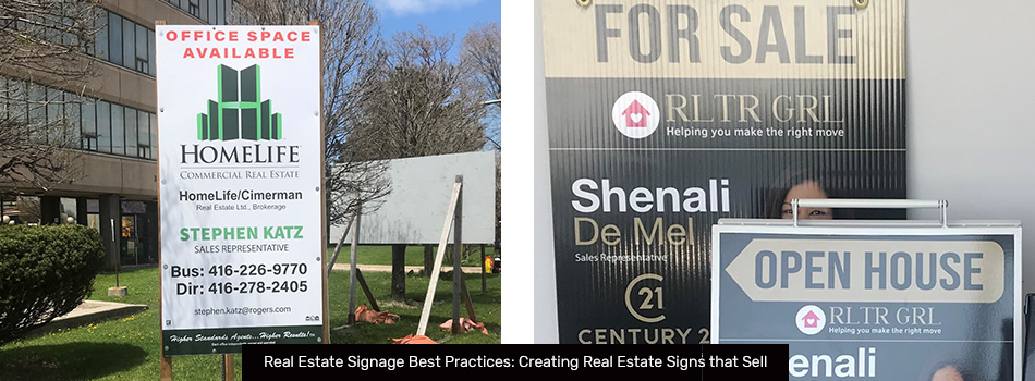
A common question among agents is what to include on a real estate sign. The answer centres on clarity and focus. Real estate signs are often viewed from a moving vehicle or across the street, so information must be instantly understandable.
Every effective sign should include:
- A strong headline, such as For Sale, For Lease, Coming Soon, or Open House
- The agent or brokerage logo for brand recognition
- A clearly visible primary phone number
- A website address or QR code for quick mobile access
- The property type (Condo, Detached Home, Commercial Unit, Industrial Space)
- A short, compelling feature highlight
The headline should immediately communicate the listing status. The phone number should be large enough to read comfortably from a distance. If including a website, keep it short and easy to remember. QR codes can also support engagement, particularly in urban areas where pedestrians may scan directly from the sidewalk.
It is important to avoid overcrowding the design with unnecessary elements. Large portraits, multiple taglines, or long descriptions can distract from the core purpose of the sign, generating inquiries about the property itself. When planning new signage, submitting project details by requesting a quote allows for proper sizing, material selection, and layout planning that supports both clarity and durability.
How to Design Real Estate Signs for Maximum Visibility
Understanding how to design real estate signs for maximum visibility requires considering how viewers interact with signage in real-world conditions. Whether positioned along a residential street or near a commercial plaza, your sign competes with visual noise, including traffic signs, storefront displays, landscaping, and other listings.
High Contrast Colours
Contrast dramatically improves readability. Light backgrounds paired with dark text — or dark backgrounds paired with light text — create immediate clarity. Bold accent colours can help draw attention, but they should be balanced to avoid overwhelming the viewer.
Large, Legible Fonts
Font selection influences both professionalism and readability. Clean, simple fonts without decorative elements are easier to read from a distance. Avoid compressing text to fit more information. Instead, prioritize fewer words with a stronger impact.
Clear Visual Hierarchy
Effective signs guide the viewer’s eye naturally. The headline should dominate. Contact information should follow. Secondary details should remain clearly subordinate. This structured hierarchy ensures the most important information is processed first.
Strategic Branding
Consistent use of your logo, colours, and typography builds recognition over time. When multiple listings in a neighbourhood share a cohesive visual identity, your brand becomes familiar to local buyers.
Professional examples of strong visibility and design execution can be seen in the gallery, where colour contrast, scale, and layout are carefully balanced. Durable, professionally produced real estate signage also ensures graphics remain vibrant despite Toronto’s seasonal weather shifts.
Real Estate Sign Layout Tips
Effective real estate sign layout tips focus on structure and composition. Even high-quality graphics and strong branding can lose impact if the layout feels crowded or poorly balanced.
Embrace White Space
White space improves legibility and creates a polished appearance. Allowing space around text and logos prevents visual fatigue and makes key elements stand out more effectively.
Balance Text and Imagery
Including a property image can add visual interest, particularly for distinctive or luxury homes. However, images should be high-resolution and used sparingly. A single, well-placed image is more effective than multiple smaller visuals competing for attention.
Prioritize Information Placement
The top section of the sign should communicate the listing status immediately. Contact details should be placed centrally or in a highly visible band. Supporting features can appear at the bottom or on a rider panel.
Select Appropriate Sign Formats
Different sign types serve different purposes. Post-mounted signs offer a traditional residential appearance. H-frame stakes are lightweight and easy to install for temporary placements. A-frames and directional signs are effective for guiding visitors during open houses.
Viewing layout examples in the gallery demonstrates how thoughtful spacing and proportion improve curb appeal while maintaining brand consistency.
What Is the Best Real Estate Sign Design?
When asking what the best real estate sign design is, the answer lies in simplicity, durability, and strategic messaging. The best-performing signs are those that combine strong design fundamentals with practical fabrication.
Successful designs typically include:
- A clear and concise call to action
- Limited, high-impact text
- Cohesive brand colours
- Professional-grade materials
- Secure and stable installation
Durability is particularly important in Canadian climates. Outdoor signage must withstand wind, moisture, UV exposure, and temperature fluctuations. Choosing weather-resistant materials and finishes protects both your investment and your brand image.
Professional fabrication ensures colours remain vibrant and panels retain structural integrity throughout the listing period. Integrated real estate signage combines design precision with quality materials to support long-term performance. Additional examples of effective sign designs are visible in the gallery, illustrating how clean layouts and durable construction enhance listing visibility.
Property Sign Design Guidelines to Follow
Clear property sign design guidelines support consistency, professionalism, and compliance across all listings.
Professional guidelines include:
- Use no more than two or three complementary fonts
- Maintain consistent brand colours across all signage
- Keep messaging concise and focused
- Leave adequate spacing between text blocks
- Select materials rated for outdoor exposure
- Confirm compliance with local municipal regulations
Strategic placement also influences performance. Signs positioned near intersections, along visible property lines, or at neighbourhood entrances increase exposure while maintaining aesthetic appeal. Avoid cluttering a single property with multiple oversized signs, as excessive signage can diminish curb appeal and affect brand perception.
Working with experienced signage professionals through the contact page ensures both creative direction and regulatory considerations are addressed before production begins. Professionally managed real estate signage supports consistent presentation across residential and commercial properties.
See More Real Estate Sign Examples in Our Gallery
Applying strong real estate sign design tips requires attention to detail at every stage — from content selection and colour contrast to layout structure and material choice. Understanding what to include on a real estate sign, refining layout composition, and maintaining durability standards all contribute to stronger engagement.
Exploring completed installations in the gallery offers practical insight into how signage performs across Toronto and surrounding communities. Thoughtful design, consistent branding, and high-quality fabrication work together to elevate professional image and support successful property marketing.
For customized signage tailored to specific property requirements, project details can be submitted through our request a quote form to develop signage aligned with industry best practices and built for long-term visibility.
Back