Understand the Psychology of Colours in Business Signs

Colour psychology is the science of how different colours affect a person’s perceptions and mood. This discipline has huge implications for business sign design, but do you know how to make it work for you? Today, we’ll discuss how colour psychology works and how you can apply it to your next order of custom business signs.
Why Do Signs Work So Well?
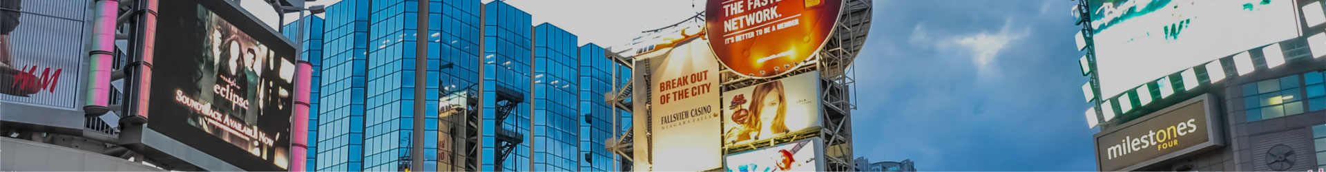
We all know how effective a well-designed sign can be. Whether it’s letting you know about the latest sales at your favourite store or pointing your way to the nearest hospital, a good sign communicates clear and specific information in an attention-grabbing way.
Colour psychology plays a big role in this process. Choosing the right colour for your signs makes them easier to spot and conveys information about your company as well as the urgency of your message.
Colours and Signs
Colours help our brains process visual information. The right colour can evoke certain feelings, draw our eye to certain places, or solidify memories and associations.
You can use all of these features to your advantage when designing business signs. For example, you can use certain colours to align your brand with values that are important to your customer base or concepts that better explain your company goals and value proposition. However, you should avoid using colours that evoke the opposite feelings and sensations to what you’re going for.
Colours 101
Each colour has something unique to say. Learn more about what makes certain colours special and how you can use them to create more effective sign designs.
1. White
White is associated with peace and purity. White signs can make your brand feel serene, which is one of the reasons it is so commonly used in signs for spas and wellness centers. Don’t get carried away, though! Too much white can start to feel clinical and imposing instead.
2. Black
Black is a bold, sophisticated colour with plenty of versatility and edge. It stands out from most surroundings, making it a great choice for words and graphics on signs. Its one major downside is that it can feel a bit boring if it’s used without clear intention. If you want to use a lot of black on your sign, be sure to give it a few extra stylistic flourishes to add visual interest.
3. Red
Red is the most attention-grabbing of all colours. It also communicates a sense of urgency, suggesting that the information it conveys requires immediate action. It’s great for limited-time promotions like sales or giveaways, but it may be too harsh for permanent signage. Too much red can evoke unpleasant feelings of anxiety that you don’t want to be associated with your brand.
4. Blue
Blue is the colour of calmness and inspiration. It both soothes and energizes the viewer, making it excellent for office signage and other informational signs. It’s also a popular choice for professional service organizations like banks, lawyers, and non-profits. Everyone likes the colour blue, so it’s a great neutral hue that can be used to target any audience.
5. Grey
Grey signs can be extremely stylish and appealing with the right contrasting elements included. Pairing this colour with elaborate fonts, graphics, or scenery makes indoor and outdoor business signs pop and gives them a chic and understated look. Don’t hold back – without these additional touches, your sign may look dull and uninteresting to your audience.
Why Colours Are So Important
- Visibility. Colour contrast is one of the easiest ways to make your sign stand out and make your message clear.
- Influence. A sign’s colours can help it better fulfill its purpose. For instance, signs in muted colours encourage calm, compliant behaviour better than signs in brighter colours would.
- Impression. Colours help you use your signs to set a particular mood. Businesses with a conservative and professional atmosphere can employ neutral tones to match their ambience, while businesses with a more playful or rebellious edge can go for bolder colours instead.
We Make Colourful Custom Signs for Businesses
Colour choice is an integral part of good sign design, but it’s also just one of many factors that make a business sign stand out. If you’re looking for eye-catching custom signs to promote your business, contact The Sign & Graphics Manufaktur today. Our team will design, manufacture, and install beautiful signs that we know will help your company grow.
Back